Reporting Redesign
Retain users by making reporting a reason to stay, not leave

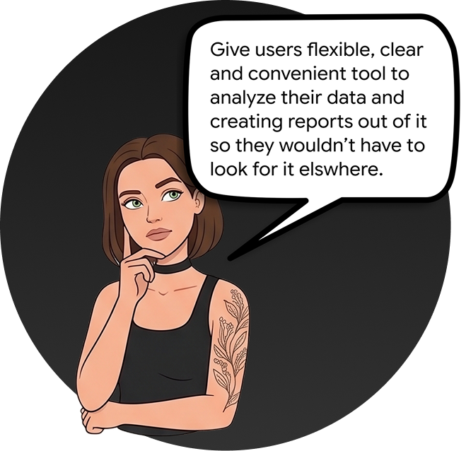
01 - Intro
A leading Nordic fintech company providing software for financial and personnel management to thousands of daily users. Years of incremental product growth had left the reporting feature as an afterthought — capable on paper, but frustrating enough in practice that users were abandoning it for Excel and external tools.
02 - Problem
People resorted to other platforms to build reports. Thousands relied on the system daily to manage their finances and personnel data — but frustration with the reporting tool had led many to export raw data and rebuild what they needed in Excel and other external tools instead.
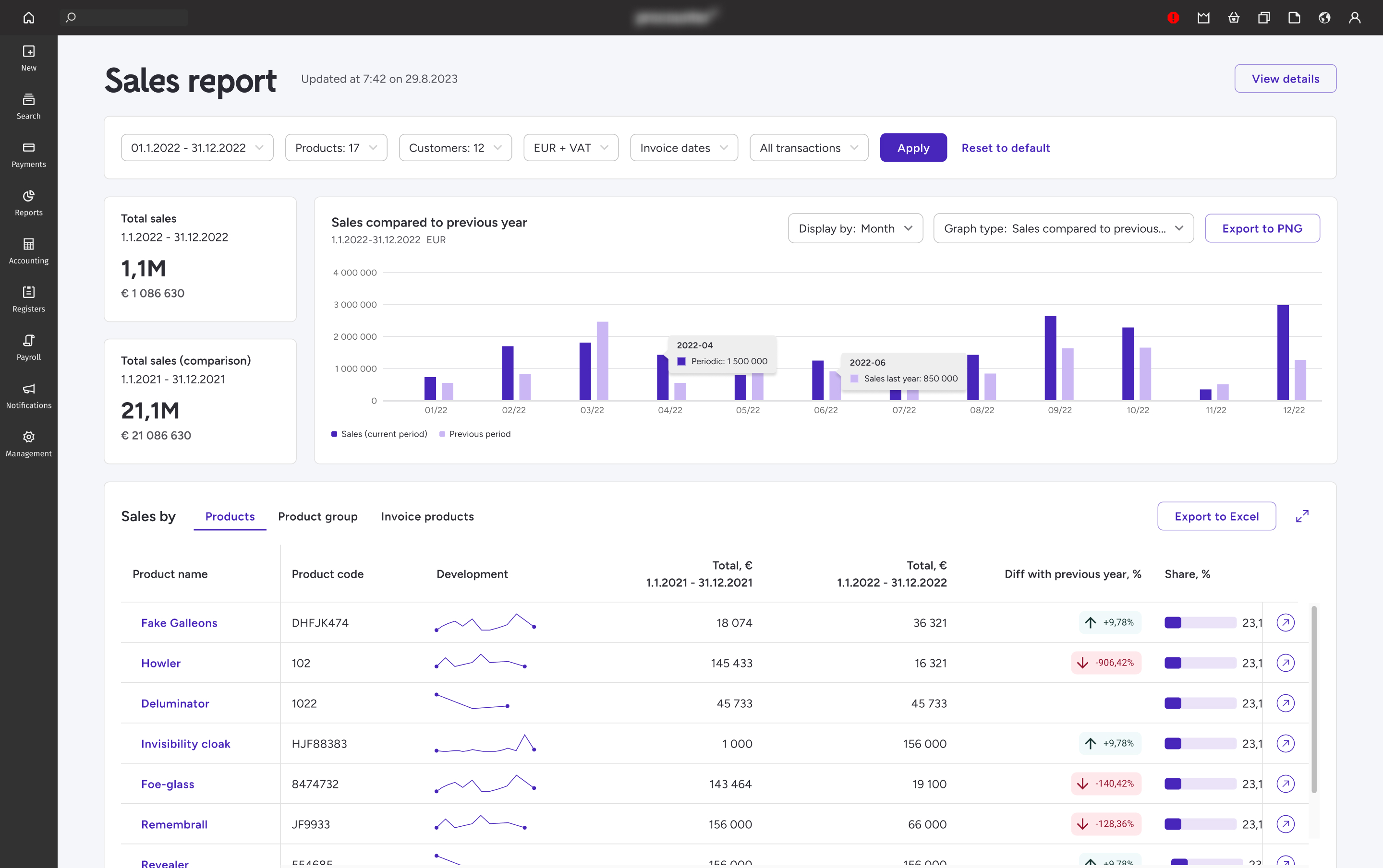
No visual distinction between active and inactive filters — users couldn't tell what was applied without re-checking every time
Interaction targets were undersized, causing frequent mis-clicks and slowing down actions users performed dozens of times a day
All figures appeared equally important — no visual weight or color coding, making it impossible to spot trends or anomalies at a glance
No way to export selectively — users dumped entire reports and rebuilt the views they actually needed in Excel
03 - Approach
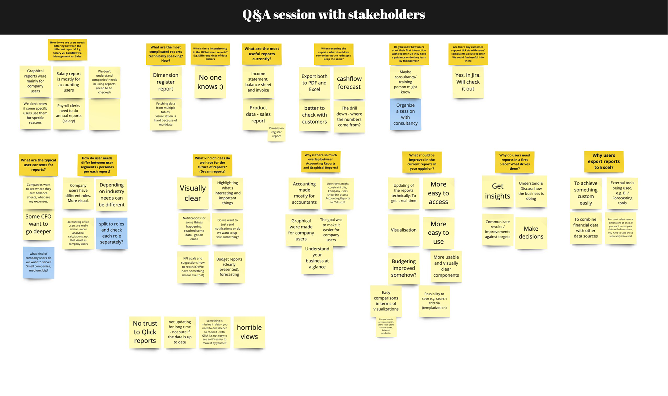
A live board through stakeholder meetings captured the backlog of complaints, while user interviews mapped how people actually report — and exactly where they gave up.
04 - Solution
Clearer filters, readable data
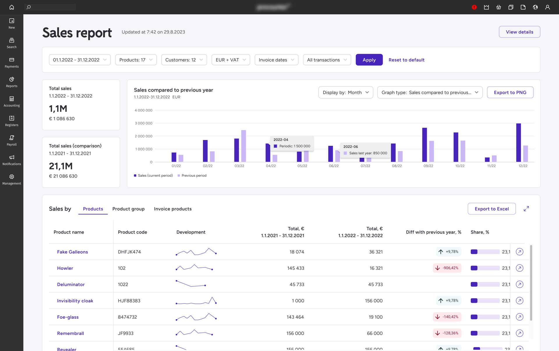
Filters now sit horizontally with their details tucked into dropdowns — each one distinct, so there's less scanning and less overload. Interaction targets are larger, data changes are color-coded to surface trends at a glance, and titles plus tooltips mean power users never reach for a manual.
05 - Impact
06 - Before & After
The clearest way to see the change is side by side — the original Sales report against the redesign.
Before
Original Sales report — dense filters, undersized targets, and a flat data hierarchy.
After
The redesigned report — clear horizontal filters, color-coded data, and interactive, exportable tables.
07 - Reflections
Front-loading research before any design work — usability audit first, then interviews — meant every decision traced directly to a specific user complaint. Stakeholder sign-off was unusually smooth as a result.
I'd define quantifiable success metrics at kickoff. Task-completion benchmarks, before/after heatmaps (e.g. Hotjar), and adoption tracking would have measured the impact far better than the single 9% usage number we could point to.
Plan the design work earlier. A preliminary workload estimate and a designer roadmap up front would have saved the time we lost debating approach at the outset — and faster iteration cycles keep momentum.

Next Project
Customer Care Tool