Customer Care Tool
Cut handling time by giving agents the order details they need, when they need them

01 - Intro
This project focused on improving the custom-built customer service tool used by a subscription e-commerce company shipping to households at scale across the UK. To manage the resulting volume of customer inquiries, the company relies on a network of Customer Care centres staffed by trained agents.
02 - Problem
The existing customer service software significantly hindered agent productivity due to usability issues and an inefficient information layout — directly increasing complaint-handling time. Agents struggled to find the order details they needed, forcing them to navigate through multiple sections of the system for every inquiry, and onboarding new agents was slow because the software wasn't user-friendly.
New orders weren't visually distinguished, forcing agents to search the full order history to find the one a customer was calling about.
Surcharges, marketplace items, discounts, and per-product pricing were missing — agents saw only the order total, and couldn't answer basic questions about it.
Delivery details lived behind a link into a separate third-party app agents had to click through to and search manually, for every inquiry.
Existing complaints tied to an order weren't shown on the Orders page — agents had to leave and check a different part of the system.

03 - Approach
I ran interviews with agents to understand their daily workflow and specific pain points, then launched a baseline satisfaction survey — over 100 responses — to measure how the team felt about the tool before any changes, with a plan to re-run it after launch to track the impact.
04 - Solution
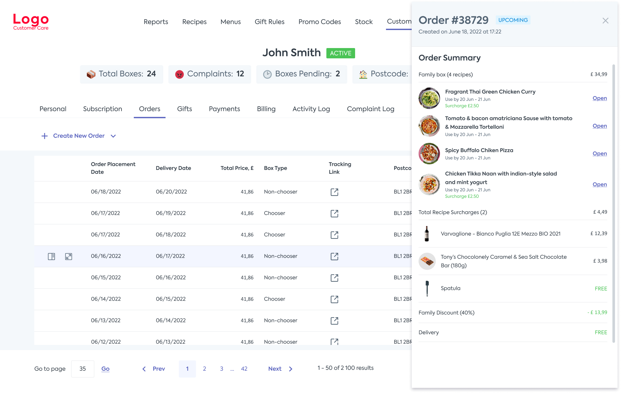
The redesign centered on a new, full order-details view — shown below in Before & After — plus a reworked Orders table that gets agents to the right order faster:
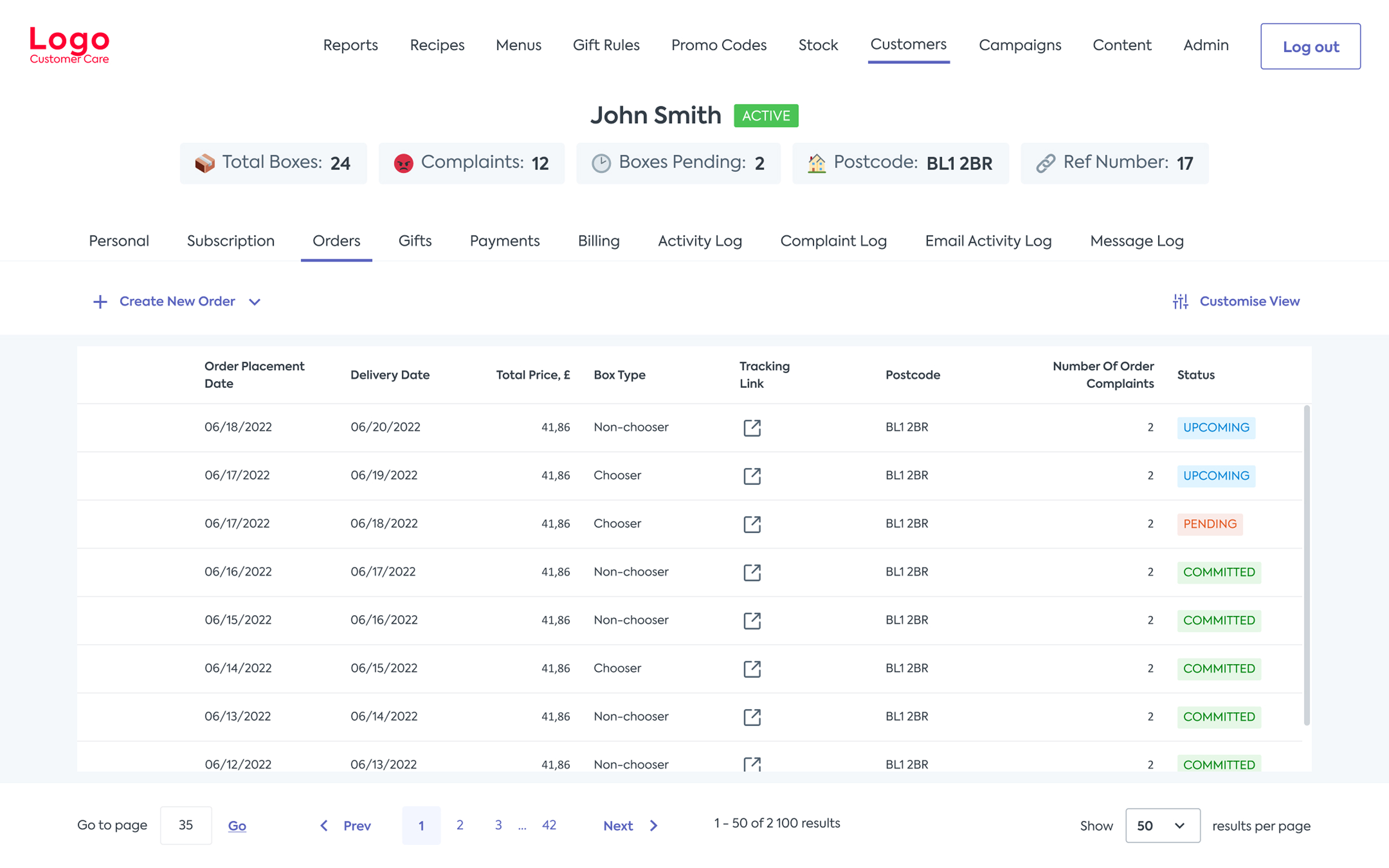
All orders and statuses at a glance
The Orders table now surfaces order list and status directly in the row, so agents can judge urgency before opening a single order.
05 - Impact
06 - Before & After
The clearest way to see the change is side by side — the original Orders page against the new order-details view.
Before
The original Orders page — no priority for recent orders, limited order details, and delivery and complaint information hidden in other systems.
After
The redesigned order-details page — item costs, discounts, delivery info, complaint history, and full event history, all in one place.
07 - Reflections
Testing early and often, using the RITE method as soon as the first drafts were ready, meant I could catch problems and iterate before investing more design or dev time in the wrong direction — five rounds later, feedback had turned consistently positive.
I'd get out from behind the screen-share and observe agents in the room. Interviews were a good foundation, but watching agents handle a live customer conversation and juggle the tool in real time would have surfaced nuances that self-reported workflows glossed over.
As the only designer on the project, constant context-switching between design work and developer conversations was the biggest drag on my output. It pushed me toward more deliberate time-blocking — and toward planning a rough roadmap up front so I always knew how much work was left.

Next Project
AI-enhanced data verification